The Power of Color Psychology in Bathroom Renovation: Transforming Moods with Thoughtful Palettes
By Total Care Bathrooms Fri Apr 03 20267 minutes
Why Color Psychology Matters in Bathroom Renovation
Color is more than an aesthetic choice; it profoundly impacts mood, perception of space, and the overall ambiance of your bathroom. Selecting the right hues can transform a utilitarian room into a rejuvenating retreat or an energizing space, depending on your lifestyle needs and aspirations.“Color is the most powerful tool in a designer’s arsenal for shaping the atmosphere of a bathroom—choose wisely, and your space becomes a sanctuary.”
Understanding Color Effects: What Do Different Hues Convey?
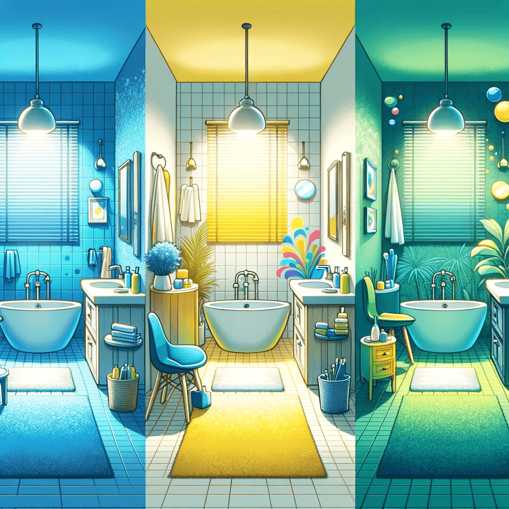
Each color family evokes distinct emotions and psychological responses. Knowing these effects helps you align your renovation with your desired mood—whether you seek calm, vibrancy, or timeless sophistication.- Blues and Greens: Evoke tranquility and spa-like serenity, ideal for relaxation.
- Whites and Neutrals: Impart cleanliness and spaciousness, perfect for minimalist or modern designs.
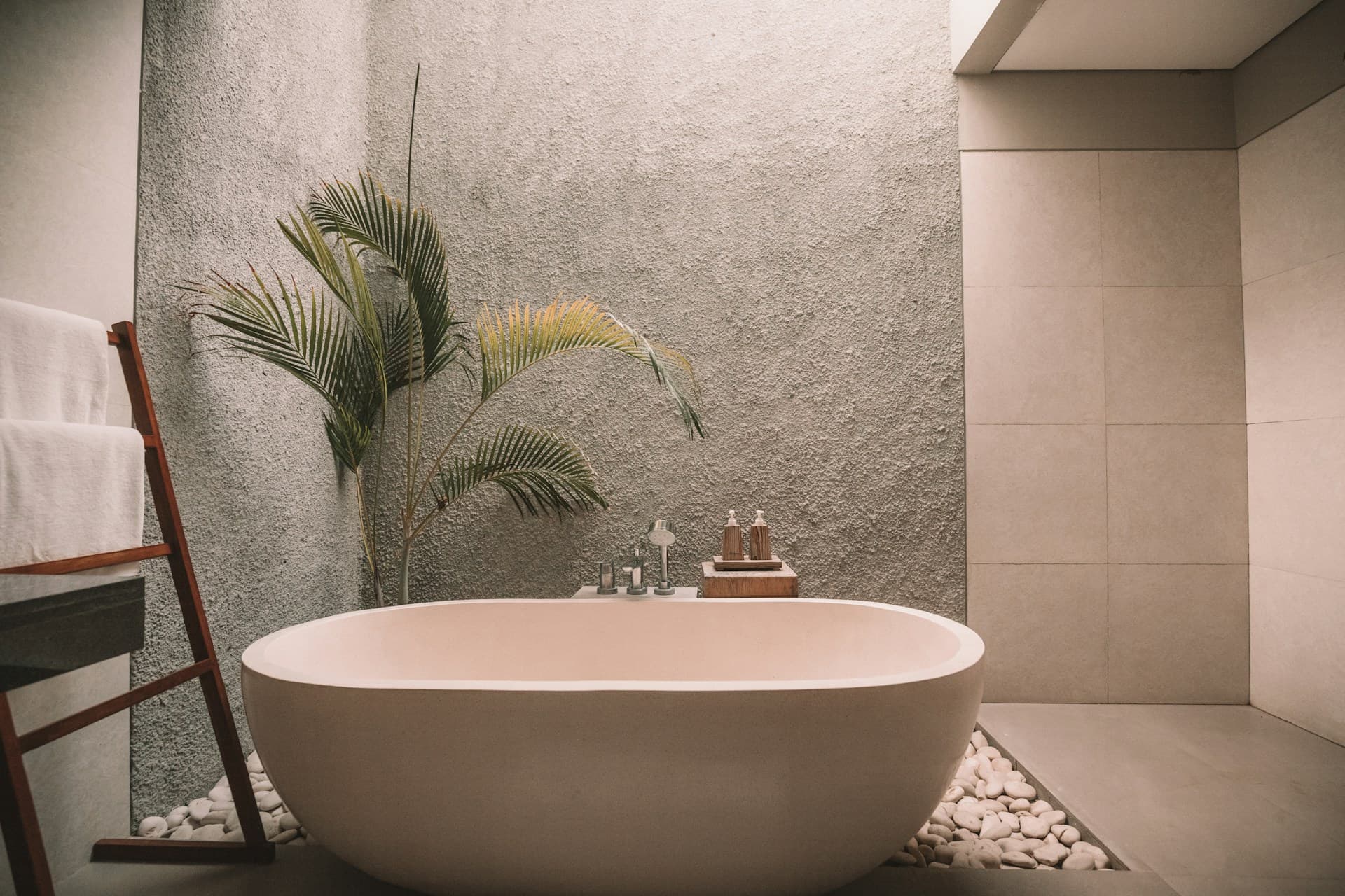
- Earthy Tones: Foster warmth and grounding, suitable for cozy, rustic-inspired bathrooms.
- Bold Colors (e.g., navy, emerald, charcoal): Create drama and a sense of luxury.
- Soft Pastels: Offer a gentle, uplifting mood, especially effective in small or low-light spaces.
Curating Your Bathroom Palette: Practical Tips for Lasting Impact
Beyond personal preference, consider factors like natural light, room size, and desired energy when selecting your palette. The interplay of wall color, tile, cabinetry, and accents can either harmonize or clash, so a thoughtful approach yields the most satisfying results.Palette Inspiration: Real-World Examples for Every Mood
| Mood | Primary Colors | Accent Colors | Ideal Materials |
| Serene Spa | Soft blue, sage green | Matte white, light wood | Porcelain, bamboo |
| Urban Chic | Charcoal, crisp white | Brushed brass, black | Marble, metal |
| Warm Retreat | Taupe, sand, clay | Terracotta, olive | Stone, wood |
| Vibrant Energy | Teal, sunny yellow | Chrome, coral | Ceramic, glass |
| Timeless Elegance | Ivory, dove gray | Polished nickel, navy | Granite, glass mosaic |
Avoiding Common Pitfalls: Mistakes to Sidestep with Color
Overlooking the impact of artificial lighting or underestimating how bold hues can shrink a space are frequent missteps. Always test paint samples in different lighting conditions and balance vibrant colors with ample neutrals for longevity and resale value.- Neglecting to sample colors in both daylight and artificial light.
- Choosing trends over timelessness if you plan to sell soon.
- Overusing dark shades in small or windowless bathrooms.
- Ignoring the undertones of tiles, grout, and fixtures.
- Failing to coordinate wall, ceiling, and trim colors for cohesion.